Interactive tool assigns COVID-19 risk level for counties, states
Published 4:04 pm Wednesday, July 1, 2020
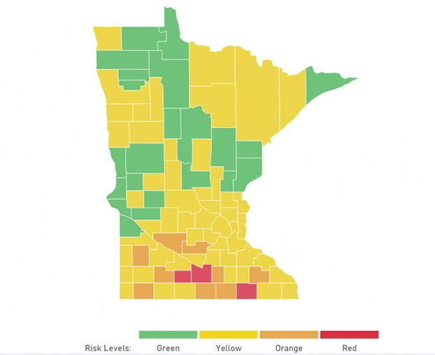
- A new interactive map developed through the Harvard Global Health Institute and other researchers and public health experts gives Freeborn County an orange COVID-19 risk level and Mower County a red risk level as of Wednesday. The red risk level has the highest risk. Image courtesy Harvard Global Health Institute
|
Getting your Trinity Audio player ready...
|
The Harvard Global Health Institute and a team of national researchers and public health experts are giving counties across the country a new tool to assess their COVID-19 risk level.
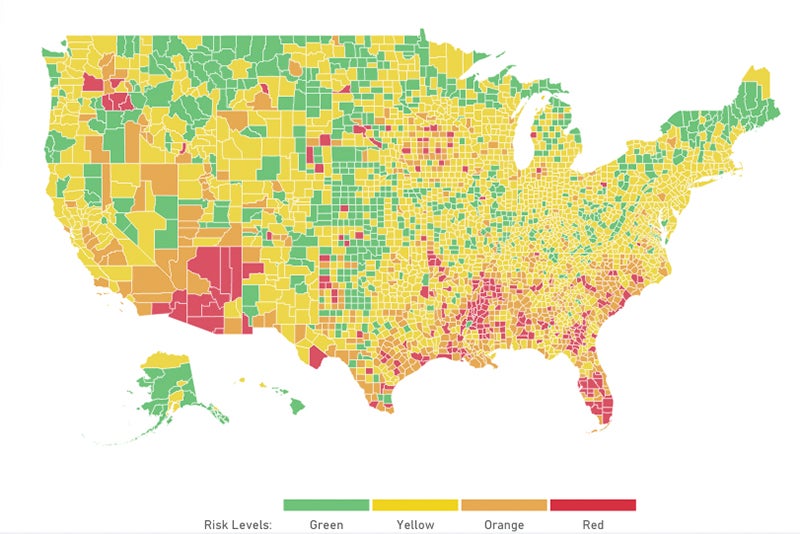
The tool, which is based on a seven-day rolling average of daily cases per 100,000 population, labels each county as either green, yellow, orange or red, with green being the best and red being the worst.
Counties with the green risk level are on track for containment and have had a daily average of less than one new case per 100,000 people over the last seven days. These communities are advised to monitor with viral testing and have a contact tracing program.
The interactive map assigns each county a risk level based on average new daily cases per 100,000 people over the last seven days. Image courtesy Harvard Global Health Institute
Counties with a yellow risk level have had a daily average of one to nine cases per 100,000 people over the last seven days and are seeing community spread. A county with an orange risk level has had a daily average of 10 to 24 cases per 100,000 people over the last seven days and is seeing accelerated spread, and a red risk level means a county has had a daily average of 25 or more cases per 100,000 people over the last week and is reaching a tipping point and recommends stay-at-home orders.
The tool gives Minnesota a yellow risk level and indicates, based on data as of Sunday, that a daily average of 6.7 cases per 100,000 people were reported over the last week.
Iowa was labeled an orange risk level and had a daily average of 11.5 new cases per 100,000 people over the last seven days.
Wisconsin, North and South Dakota were also labeled a yellow risk level.
As of Wednesday afternoon, Arizona, Florida and Mississippi were the only states labeled as red, though much of the southern half of the country was orange. Vermont and Hawaii were the only states labeled as green.
“The public needs clear and consistent information about COVID risk levels in different jurisdictions for personal decision-making, and policy-makers need clear and consistent visibility that permits differentiating policy across jurisdictions,” said Danielle Allen, director of the Edmond J. Safra Center for Ethics at Harvard University, on the website. “We also collectively need to keep focused on what should be our main target: a path to near zero case incidence.”
In Minnesota, much of the state was labeled as green and yellow, though several counties in southern Minnesota had orange and red identifications.
Watonwan, Blue Earth and Mower counties were labeled as red. It stated Mower County was seeing a daily average of 40.3 new cases per 100,000 people over the last seven days.
Freeborn, Faribault, Waseca and Olmsted counties were labeled as orange. The tool said Freeborn County was seeing a daily average of 13.7 new cases per 100,000 people over the last week.
In addition to the Harvard Global Health Institute, other participating entities include Harvard’s Edmond J. Safra Center for Ethics, Rockefeller Foundation, CovidActNow, Covid-Local, CIDRAP and others.